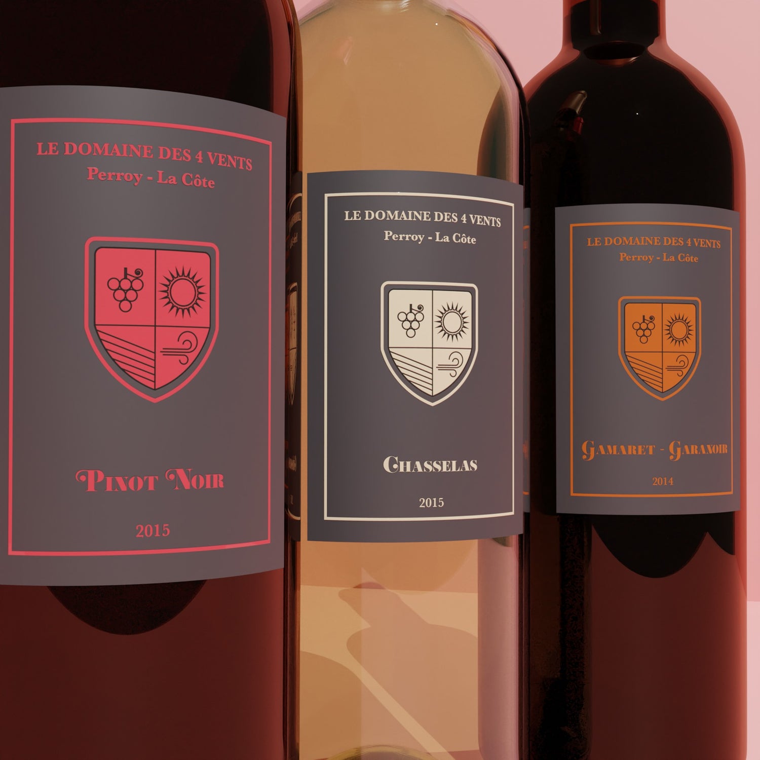
The Domain of the 4 Winds
Wine Labels, Visual Identity
The visual identity for a trilogy of wines had to be created for a Vaudois vineyard.
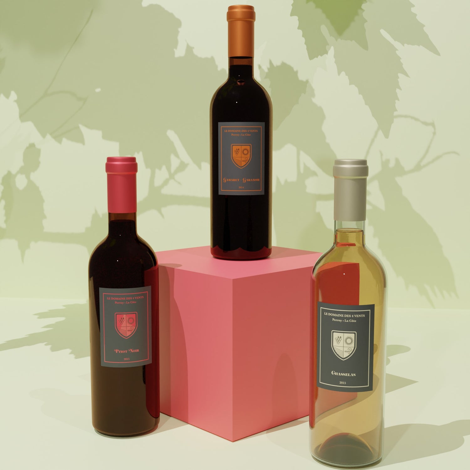
A blend of Gamaret-Garanoir 2014, ample and generous on the palate, with firm tannins, aromas of black fruits and notes of toast and clove. A Chasselas 2015, light and refreshing, with a marked mineral character with notes of lime and grapefruit, and finally a Pinot Noir 2015, supple and harmonious, fruity, light and silky, which expresses itself on notes of raspberry and redcurrant associated with a touch of undergrowth.
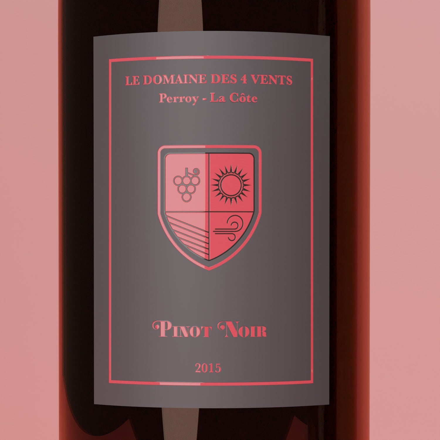
As the producer wanted to stand out from the classic labels with attractive and distinctive colours, each type of wine was represented by a colour typical of the aromas that compose them.
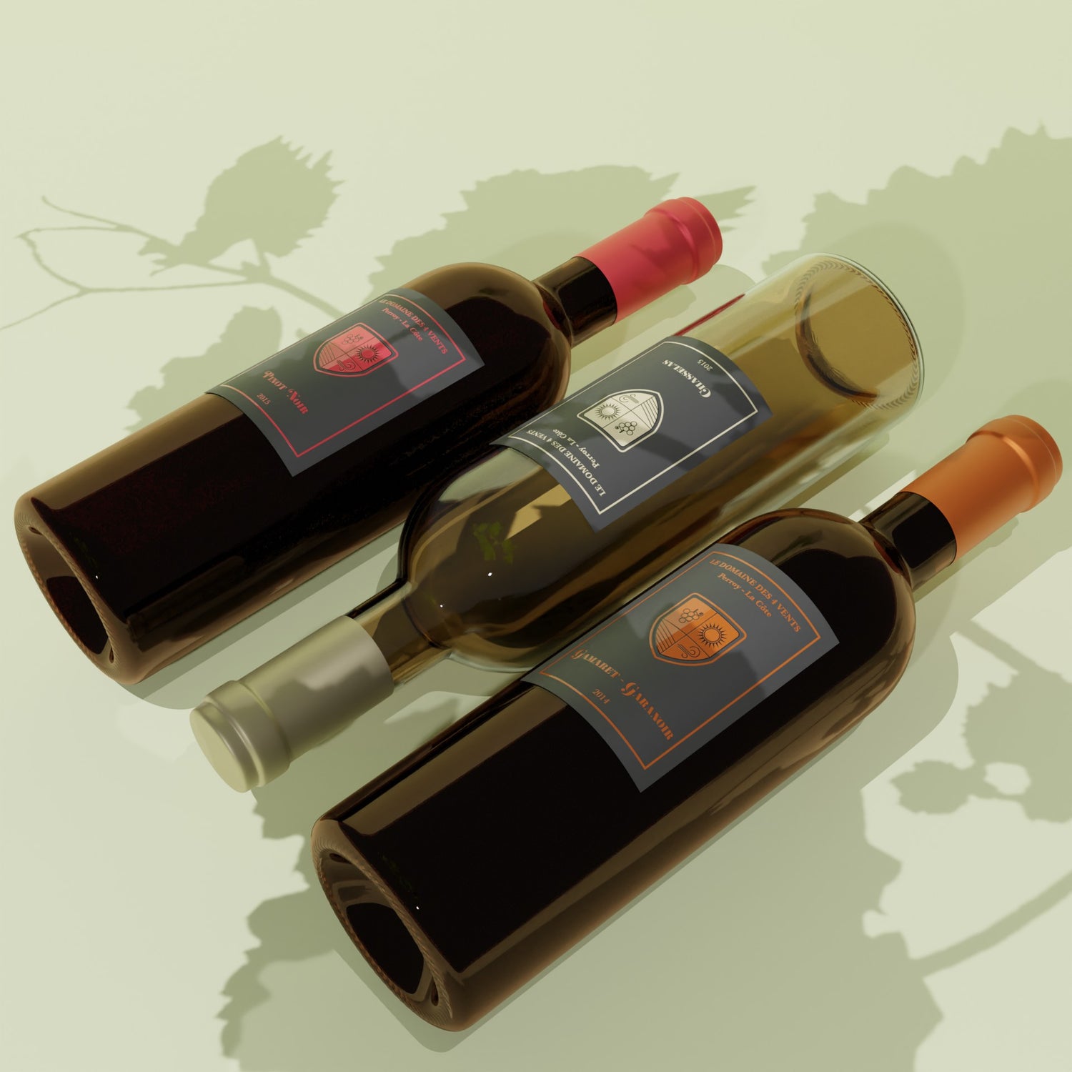
The intensity of Gamaret-Garanoir was expressed by the color of toast and cloves. The lightness of Chasselas was represented by the color of lime blossoms and finally, the fruitiness of Pinot Noir was represented by the color of raspberries. By contrasting with a neutral gray in the background, the colors are enhanced and thus become more vivid. In addition, this background brings a sophisticated touch.
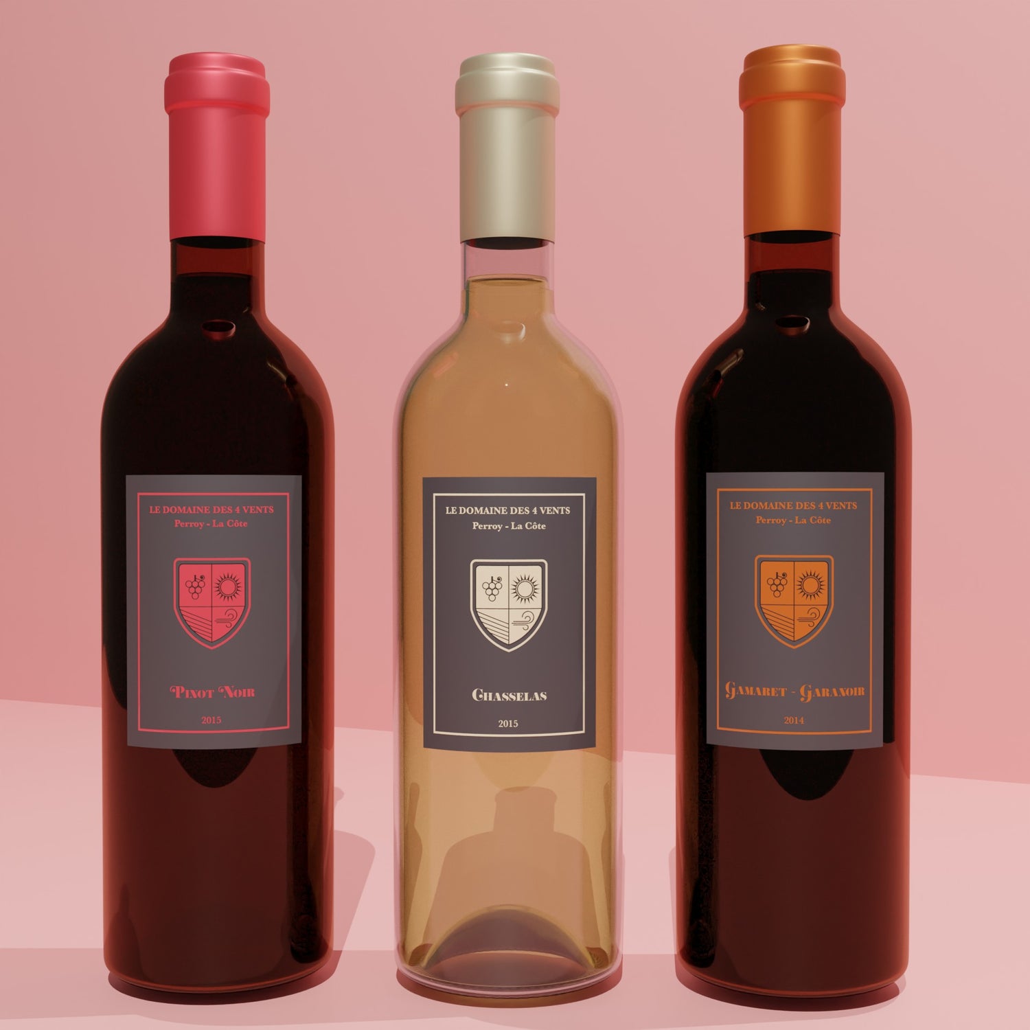
Printing these label templates on satin and matte paper for the background and with a glossy selective varnish for the bright colors, increases the contrast and makes the final result more elegant. The elements of the sun, water, grapes and wind that make up the name of the vineyard, have been defined on a badge to accentuate the modern side while integrating the heritage of the brand.
