Illustrations for Books
Illustration, Book Cover
Pay homage to the art of words with refined and unique illustrations to enrich your projects.
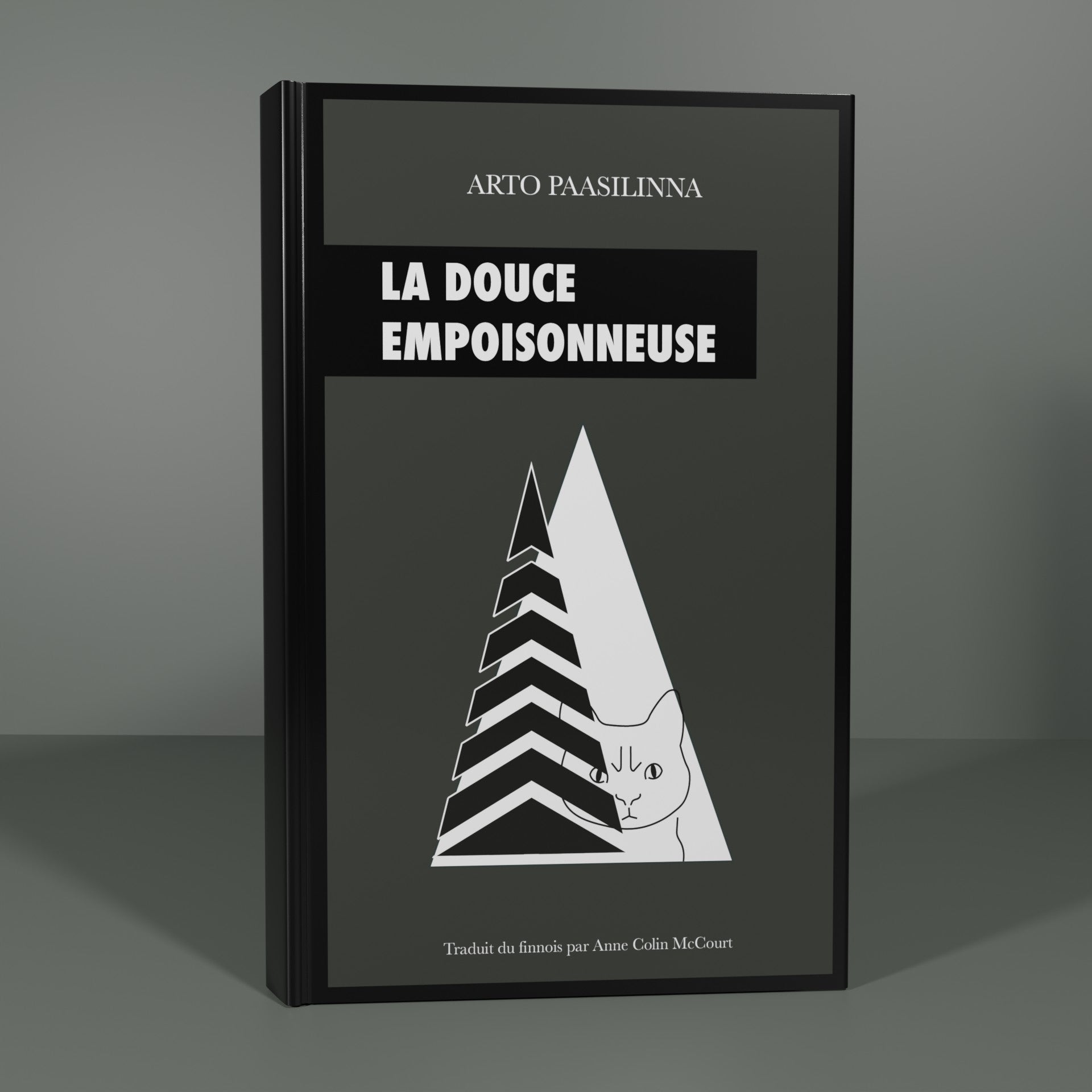
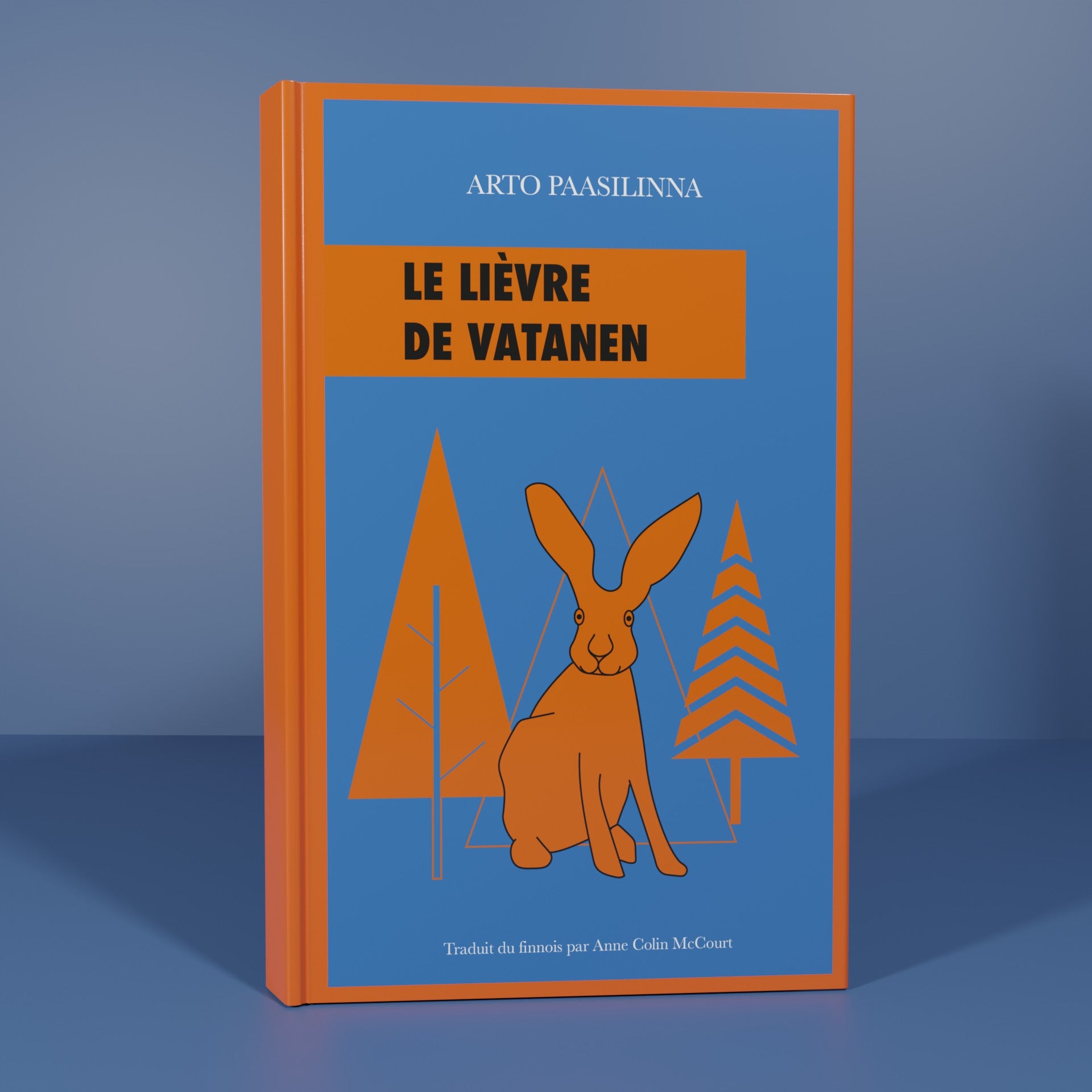
Arto Paasilina Collection
For this project, the goal was to use the different types of chromatic contrasts. Namely, the color itself, complementary colors, warm-cold, chiaroscuro, quantity contrast and quality contrast. A strong visual coherence should also be easily detected between the 6 covers of the collection.
For the visual identity, minimalist and geometric shapes were chosen to recall the Nordic style that was the foundation of this collection. On all the books, the titles of the covers were declined in a simple cartridge at the top left in order to facilitate the identification of the entire collection. Finally, regarding the theme of the illustrations, the main elements or elements that played an important role in the development of the story were chosen.

